📊 The New Era of Data Visualization: Advanced Charts and Dashboard Designer
Are you tired of boring and static data visualizations? Do you want to make data-driven decisions with ease? Look no further than DataBox's new and improved visualization types and dashboard designer. In this article, we'll explore the latest updates and show you how to use them to visualize your data your way.
📈 Advanced Charts
DataBox has added five new visualization types to their library, including the radial progress visualization, spider diagrams, horizontal bar charts, bubble charts, and data stories. Let's take a closer look at each one.
Radial Progress Visualization
The radial progress visualization simplifies goal tracking by allowing you to add multiple metrics to see how your goals are progressing within a specific project. With this visualization, you can easily track your progress towards your goals and adjust your strategy accordingly.
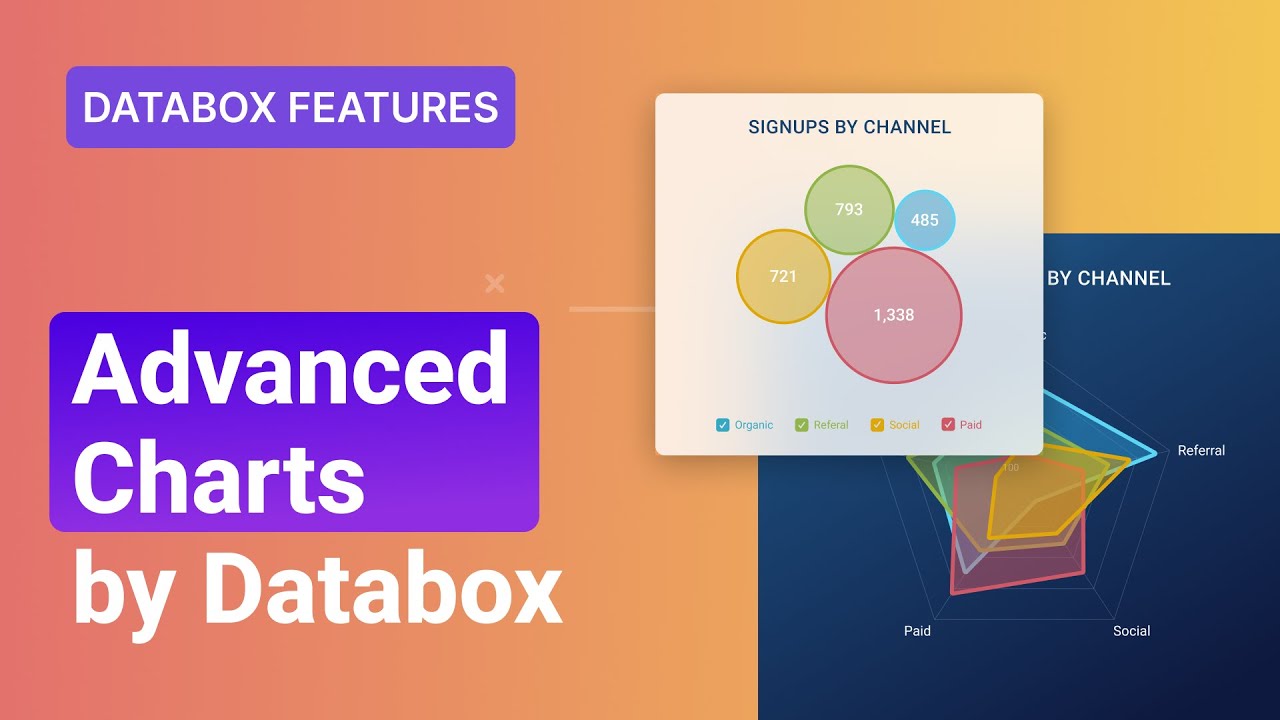
Spider Diagrams
With spider diagrams, you can compare metrics and related dimensions to quickly spot patterns and anomalies in your data. By observing the polygon shapes, you can easily identify areas that need improvement and make data-driven decisions to optimize your performance.
Horizontal Bar Charts
Use a horizontal bar chart to compare the performance of different dimensions or metrics with the length of the bars representing your values. This makes it easy to spot top-performing categories and identify areas that need improvement.
Bubble Charts
The bubble chart helps you explore data relationships with the bubble size representing your metric values. This allows you to quickly pinpoint correlations between your metric and dimensions and make data-driven decisions to optimize your performance.
Data Stories
Data stories are easy-to-read text summaries about how your metric is performing. Your text will update automatically with the latest data, giving you more time to focus on what matters most. With data stories, you can quickly get the insights you need to make data-driven decisions.
🎨 Dashboard Designer
DataBox has also worked on improving the dashboard designer and existing visualizations to make the charts more intuitive and give you the flexibility to visualize and explore your data however you want. Here are some of the new features:
Add Metrics with a Single Click
You can now add metrics to your dashboard with a single click, making it easier than ever to create comprehensive dashboards.
Switch Between Different Visualization Types
Quickly switch between different visualization types to find the best way to represent your data. This gives you the flexibility to explore your data in different ways and find the insights you need.
Select Multiple Comparison Periods
Select multiple comparison periods to see how current performance compares to past trends. This allows you to identify areas that need improvement and make data-driven decisions to optimize your performance.
Add Multiple Metrics to a Single Visualization
Add multiple metrics to a single visualization to better understand how different metrics relate to each other. This allows you to identify correlations and make data-driven decisions to optimize your performance.
Change the Color of Individual Metrics
Change the color of individual metrics to make it easier for viewers to understand your insights. This allows you to highlight important information and make data-driven decisions with ease.
Manually Change the Order of Dimensions and Metrics
Manually change the order of dimensions and metrics to make the most important information stand out. This allows you to focus on the insights that matter most and make data-driven decisions with ease.
With these new features and enhanced flexibility, you can now create more powerful and comprehensive dashboards, making it easier than ever for you to get the insights and answers you're looking for in your data.
🎉 Highlights
- DataBox has added five new visualization types to their library, including the radial progress visualization, spider diagrams, horizontal bar charts, bubble charts, and data stories.
- The dashboard designer has been improved to make the charts more intuitive and give you the flexibility to visualize and explore your data however you want.
- You can now add metrics to your dashboard with a single click, switch between different visualization types, select multiple comparison periods, add multiple metrics to a single visualization, change the color of individual metrics, and manually change the order of dimensions and metrics.
❓ FAQ
Q: What is DataBox?
A: DataBox is a data visualization platform that allows you to create powerful and comprehensive dashboards to make data-driven decisions with ease.
Q: What are the new visualization types added by DataBox?
A: DataBox has added five new visualization types to their library, including the radial progress visualization, spider diagrams, horizontal bar charts, bubble charts, and data stories.
Q: What are the new features of the dashboard designer?
A: The new features of the dashboard designer include the ability to add metrics with a single click, switch between different visualization types, select multiple comparison periods, add multiple metrics to a single visualization, change the color of individual metrics, and manually change the order of dimensions and metrics.
Q: How can I use DataBox to make data-driven decisions?
A: With DataBox, you can create powerful and comprehensive dashboards that allow you to visualize and explore your data in different ways. This gives you the insights you need to make data-driven decisions and optimize your performance.

